
Disclaimer:
This content is not affiliated with, endorsed, sponsored, or specifically approved by Flamebait Games. Flamebait Games is not responsible for its content.
Welcome back to this little artistic journey! This time, I intended to go a different route. A route which I haven’t seen before.
To do that, I thought I’d go the opposite of simplistic and crowd-pandering… deep and overly complex.
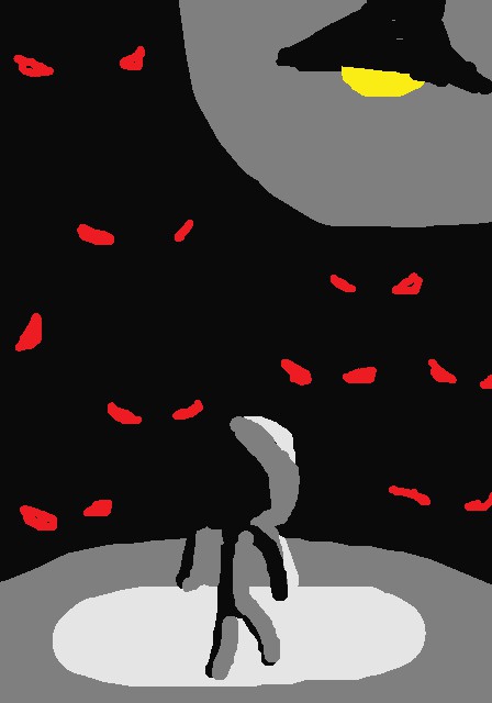
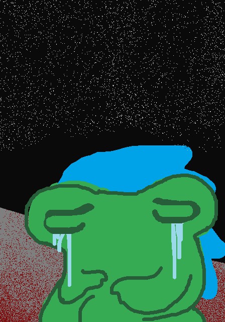
Started off with a figure shrouded in darkness, faced down with eyes of red, representing their fears and insecurities, manifested in these red eyed beings.
The circle of light shows the area where they are comfortable. See how unwilling they are to move from this area. The eyes are how they perceive the unknown.
It’s a piece showing how people view unknown things. They see them as threats to their lives, ever looming closer. The light is only a small area, and their view could be massively increased by simply looking past these fears but they won’t look any further than that.
Or… I’m just pulling all that out of my ass, and I have no clue what it meant when I drew it initially. Take your pick.
Unfortunately this didn’t capture the attention of the punks in the alley, my intended target, but it did get Benjamin on my watch list. So I pushed onward.
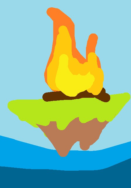
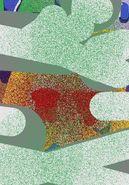
The fire on the island represents the warmth of isolation. It shows that even though those alone can seem stranded away from the rest of civilization, they still have heat to offer. (art = heat in this case)
As an artist, this hits close to home. (I was getting in character)
Anyways, this one also struck out with those punks, but not with Benjamin who was beginning to be a bit of my #1 fan.

This beautiful picture shows how isolated the earth, us, is from the cosmos. The dots are stars: white dwarves, red supergiants, blue hypergiants. Stars with their own planets, their own worlds, cut off from us with light year upon light year of empty space.
It… I’m getting bored of explaining… It’s another drawing. Another super complex drawing.
Punks hated it, Ben loved. So… yeah. What else is new?
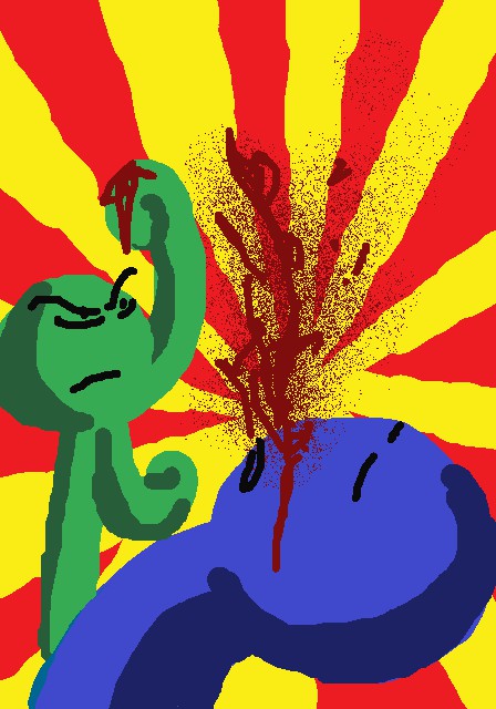
Well, I unlocked the spray can. Used it to make a bit of a bloody comic-y fight pic.
Ben bought it, and I thought to myself, Hey, let’s see where this goes! What endings can good ol’ Benjamin provide?
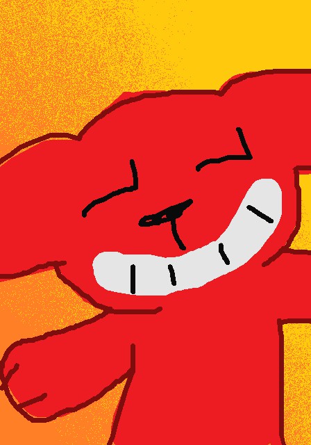
Drew a shot of Red. He looks happy. Lot of warm colors in this one.
After Ben purchased this, a notification popped up that the hipsters decided I was too popular to be appreciated by them.
I stared in shock at this message, then at Benjamin. I wondered what this meant for our future together.
Ben began to chastise me for just being a simple painter. My emotions of having a close friend turn on me are reflected in this picture.
The bitter sadness of betrayal.
Eventually one of the bearded fellows bought it, but Ben’s words left a hole in my metaphorical heart.
Since the sad picture sold well to the bearded guys, I thought I might
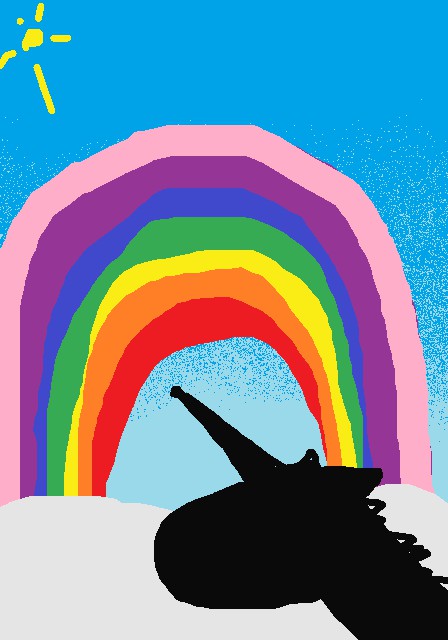
Somehow, I managed to capture the attention of the punks with this.
Guess they like rainbows.
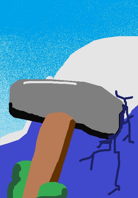
On the other hand, everyone despised this one.
Despite its hopeful meaning in its message. The idea that climbing upward would lead to good things was lost on the alley dwellers.
The most common criticism I was getting from the punks was that they didn’t like the colors… Something kind of clicked but I was still unsure of something.
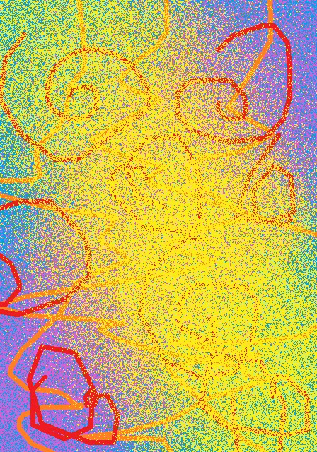
I first tried using ALL the colors. Every color on the palette was used at least once in this piece.

WOOH! BIG BUCKS! This mishmash of complexity and colors was a hit with the punks! They loved something about it!
I was unsure of what, but I wasn’t about to stop the money train now.

Ahem… Figure of a Red Eye Crying plastered on a tall bucket resting on a bed of blue splotches, laying on a note, written in green ink, ALL on a gradient of black, purple and light blue.
Anyways, this sold, but not to my intended audience. They didn’t like the colors it seems.
Thought I’d try again.
Did not work. This picture was a commercial flop.
I decided a new direction was in order.

Yeah… the “new direction” was just colors. LOTS of colors.
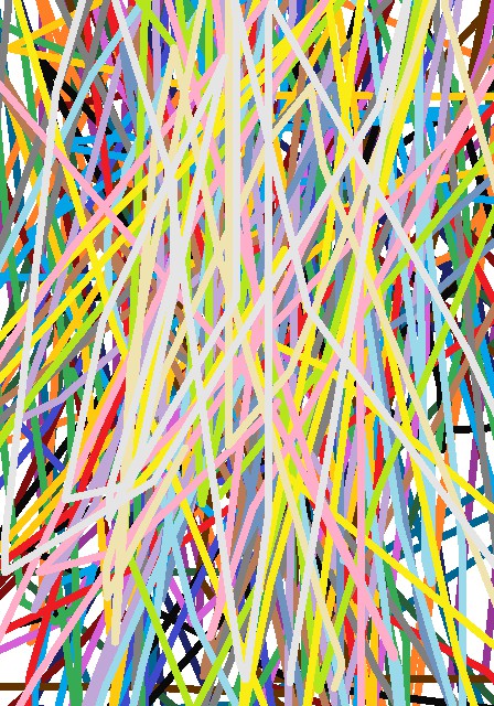
By now, I was sitting back in my chair, groaning “What do you WANT from meeee?”
Something in me clicked. They like specific colors. Not all colors.

They loved this one. They dropped mad cash for it, despite the lack in effort and skill.
I was beginning to realize that bright flashy colors were the way to go!

It turns out these punk girls are a real fan of 80’s colors. Bright neon was clearly the way to go!
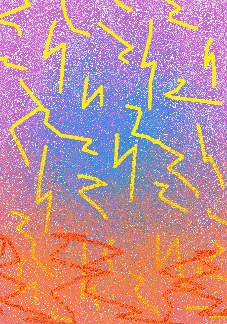
Went with a lightning theme for this one.
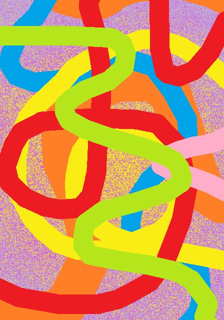
NEON WORMS!
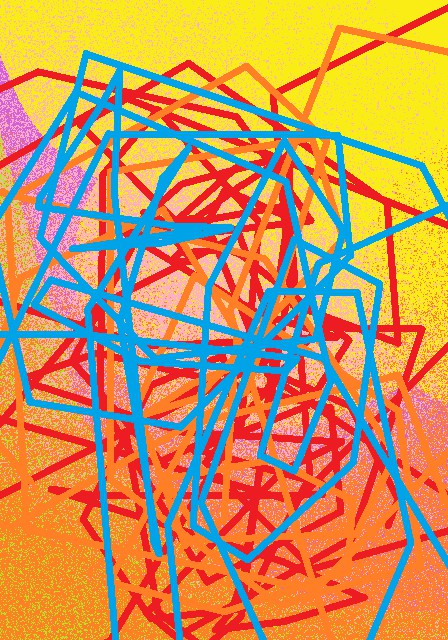
Blue and yellow looking turd or something.
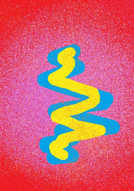
Neon Noodles!

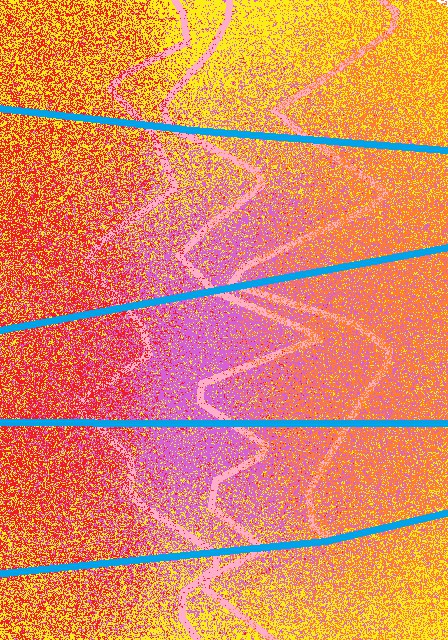
Looks like a flag was washed out with colorful lines.

This one does too.
Well, this is the picture that got me brought up to the next level! See you then!